
I accidentally came across Formula One’s new logo and I like it. It’s sleek. Modern. I get what they are trying to portray with their new look. The “F” in the graphic icon looks like a racetrack or a road. Perfect for a racing logo! The number “1” is slanted and looks quite sleek. The old logo, which was in place for 23 years, was also quite good for the time. It was a clever logo with the number “1” secretly imbedded within the graphic icon. It was time to “modern it up” and I like it. Great job on the logo!
![]()
![]()
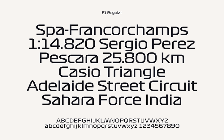
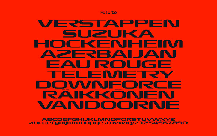
I like the font that is being used in the logo. It’s different and eye-catching. It looks like they have their own custom font and its variations:
F1 Regular
F1 Torque
F1 Turbo

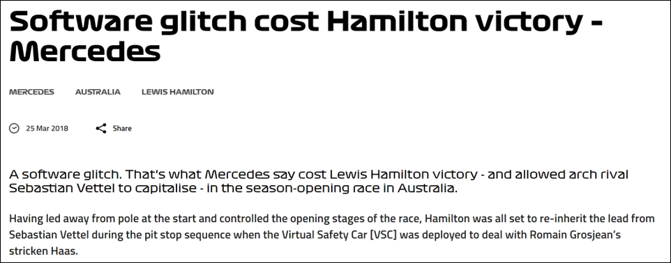
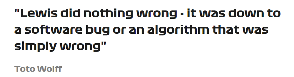
But that’s where my affinity for the font ends. When I went to their website, the use of their font made it is extremely difficult to read. I am a believer that your website should stick with simpler, web-friendly fonts or similar. It is painful to read their site! If you click on an article, the custom F1 fonts are used in the headline and the sub-headline. Once you get to the paragraph of content, it is a more readable font, although still not the best. I am not sure what font it is, but it’s not great. I think they needed to create one more level of their customized F1 font to a more easily readable font. Great job on the rebrand otherwise!
See what you think.

The content on your website occupies the majority of your site. Prospects and customers go to your site for a specific reason – they want to read your content. They want to get an answer to a question they may have. They need a particular piece of information. When a site is difficult to read, whether it’s the font, font color or font readability, you are giving the viewer a reason to leave your site. No company ever wants to do that! In fact…don’t ever give your audience a reason to leave your site.
Check out related articles on the subject:
A Few Things to Consider When Using Web Fonts
It’s Not My Font – The Importance of Typography in Web Design
Wieden + Kennedy initiates rebrand of Formula 1 with new logo and typefaces
F1’s New Font Is Killing My Eyeballs
![]()
![]()
![]()
![]()
Please contact Anna Brice at Pinnacle Peak Marketing, Scottsdale AZ about Marketing for Small/Medium Business.
Email: anna@pinnaclepeakmarketing.com
Phone: 480-661-0292
Website: https://pinnaclepeakmarketing.com